Business Applications
Desktop Publishing Typography
BY DAN FRUCHEY
The most common subject debated among desktop publishers is typography, the arrangement of text on a page. Which text families should you use? How many fonts? Typography is so basic to desktop publishing that we sometimes overlook it in favor of discussions on graphics and the merits of publishing programs.
Any publishing program can be used effectively if you understand some of the basic concepts of typography. The fact that your software can import 11 picture formats and rotate graphics won't necessarily give your documents a finished look. Some of the most readable documents I have seen used few graphics or none. The key to producing an effective document is the effective use of type.
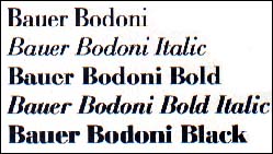 |
The Bauer Bo- doni family. A specific size and design of text is referred to as a Font. A group of fonts that use the same design but come in differ- ent sizes are re- ferred to as a typeface. When a group of simi- lar faces are gathered to- gether they are referred to as a Family. |
Before we go anywhere with this idea let's define some basic terms and concepts necessary for any desktop publisher. A specific size and design of text is referred to as a Font. A group of fonts that use the same design but come in different sizes are referred to as a Typeface (or just face). When a group of similar faces are gathered together they are referred to as a Family. Thus, 10-point Bold Bodoni text would be a font, Bold Bodoni would be a face, and Bodoni would be the family to which bold and all the other variations belong.
When you buy an outline font (used by Calamus, PageStream and UltraScript) your are actually buying a face. The face can be scaled to any font size you desire. If you are buying bit-mapped fonts for programs such as Timeworks Publisher and Easy Draw, you're buying true fonts with predefined sizes.
How do you measure fonts? I'm glad you asked! The alphanumeric characters of a font are measured vertically using the point system. A point is roughly equivalent to 1/72-inch. If you are uncertain about the size of a font, measure an uppercase "E" to determine the correct size of the character set. Be warned, though: sometimes the font size described by the software won't equal the actual font size printed. If you're serious about publishing, consider buying a font template from an art supply store and verifying the size of your text.
Selecting Fonts
The most commonly used font sizes include 8, 10, 12, 14 and 18 points. An 8 point font is used for footnotes, super- and subscript characters and those little legal notices printed on software warranties; 10-point text is used for the body of a document; 12-point text is normally used for subheadings or body text in publications intended for young or elderly readers who might have trouble discerning letter forms; 14- and 18-point fonts should be used for headings, captions and banners.
Now that you know a little about evaluating text sizes, fonts, faces and families, you need to select text designs that will convey your message in the best manner. Start by choosing a family for the body text of documents; it should be clear and easy to read. Letters should have clean lines and curves without a lot of decorative flourishes that might slow reading or make character identification difficult.
All type styles follow two basic forms: Serif and Sans-Serif (or, those with serifs and those without). The serifed families are the oldest and most popular, having been in use since the early days of the Roman Empire. The letters contain cross-strokes on the ends of letters. These cross-strokes act as guidelines for the eye and reading becomes easier with less fatigue. Common serifed fonts include Times-Roman (Dutch), Bodoni and Century Schoolbook. Sans-Serif fonts, based on some of the Humanistic designs developed in Germany and Switzerland in the 19th century, are also popular but less widely used. The letters are clean and easy to read but they lack the eye-following cross-strokes used in serifed designs. Still, they are popular for the variation they provide from the "standard" serifed text styles. Common SansSerif designs include Helvetica (Swiss), Avant Garde and Triumvirate.
Other fonts you might use regularly are known as Display faces--stylistic designs that evoke a particular mood, theme or period. Normally these styles should only be used for titles and headings (14-point or larger). If you drop below a 14-point size the text becomes difficult to read because of extra flourishes and unusual letter shapes. All of the Display faces are great "attention grabbers" but using more than a few words will defeat their purpose. Examples of Display faces include Old English, Chancery and Isabella.
Whenever you use any font, keep changes to a minimum. Items you wish to highlight may actually become deemphasized if you change font families too often. Many experts recommend no more than two or three changes in a document. One of the easiest ways to separate the new user from a veteran is to note how often fonts are changed. The new user often will take advantage of every font available as often as possible on the same page, usually creating a collage of conflicting design ideas.
Adding Emphasis
Use text-style changes sparingly. If every other word is emphasized in italics, the eye-drawing capabilities of the style are diminished or lost. When you do wish to emphasize a word you'll find that bold usually stands out better than italics.
Titles, captions and headings can be stressed if you use a font from a different family. An article on Great Britian's history becomes more noteworthy when the headings are set with an Old English font. A report on monasteries might become more intriguing with titles set in an Uncial style, etc.
You can drag a reader's attention to an article by using some standard devices that use text effectively. Write the first three or four words of the first sentence in an article in capital letters, or set the first word in a larger font size or use a different font family. Just remember the trick is not to overdo it.
Standardizing
Define a standard text format you wish to use before getting started and then maintain that format throughout the document. Select a family and font size for body text, choose the number of columns you plan on using, the number of carriage returns between subheadings and body text, the font size for headings, etc. It's a good idea to keep a reference page that defines your format, especially if you're creating periodicals such as newsletters.
We are all creatures of habit. A format that changes from page to page is unnerving and irritating. When you buy START, you subconsciously expect certain things from each issue. The name of the magazine will be in the same place on the cover, mastheads and editorials will be in the same places each issue, etc. When things change radically from page to page or issue to issue, readers lose interest no matter how good the publication.
Readability or Style?
You have a message you want to share. Give it the best chance possible by increasing readability whenever possible.
In newspapers and magazines, lines of text normally contain fewer than 14 words. If the eye has to travel too far, reading becomes a chore. Most magazines and newsletters use two or three columns of text per page to stay within this limit.
Two justification themes rule: ragged-right and justified. Justified text looks good because of the even width of columns and margins. However, the wide, uneven spacing generated between some words tends to slow reading speeds, and the occasional single word sprawled margin-to-margin across a column looks terrible. Ragged right, also known as left-justified, makes reading faster and easier because of the even spacing between words. When in doubt, stick to ragged-right.
Sometimes a page of text appears dark and difficult to read. The problem? The lines of text are set too close together. Adjust the leading (line spacing) to let in a little more light. Generally, the amount of leading between lines of text is equal to 20% of a font's point size. Thus, a document using 10-point text needs at least two points of leading between each line of text.
Closing Thoughts
Whatever you do with your fonts, remember: readability rules! These are satisfactory guidelines followed by many successful publications but they hardly begin to touch what is possible with text. Try adopting a few of these ideas to improve the appearance and readability.
Dan Fruchey works as a paramedic in Santa Rosa, California and runs a small clip-art business on the side.