
Exploring The Wild
FONTier
by David Richardson
AC Staff Columnist
by David Richardson
AC Staff Columnist
This column is not the result of the desktop publishing of Unicorn Publications. It was printed entirely by a program called Daisy Dot III, a print processor. The printer used was a Star NX-1000, and the DOS was SpartaDos 3.2d. A camera-ready copy was sent to the publishers and they then inserted it directly into the magazine. DD3 is a shareware program. See the information at the end of this article if you are interested in acquiring DD3.
In my last column, I said I would show you how to use PrintShop icons with DD3. Here is how it's done.
Thanks, John!
The first thing you need is a utility created by John McGowan called PSTODD3.BAS. It is a public domain program written in BASIC and it works very well. I include this utility, along with other DD3 related programs, with my Daisy Dot III User's Guide, available on disk.
Decisions, Decisions!
Once the program is loaded, you are asked which disk drive is the source (the PrintShop disk) and which is the destination (the font disk, already formatted). You must know the correct name of the PrintShop icon. It is then converted into the first character, out of a possible 30, DD3 multi-file font. I will explain what multi-file fonts are later. Once the icon is converted, you are then asked for another icon. You can insert another PrintShop disk if you want, and choose an icon on the new disk. Once you have converted the icons you want, you hit control-Q, and PSTODD3.BAS finishes out the font.
One converted icon takes up three characters. Since there are ninety characters possible in a DD3 font, you can have up to 30 icons in a font. Doing this, however, would create a huge font file, over 300 sectors according to the Mr. McGowan's documentation. John recommends limiting each font to about five to ten icons. I think that this is a good idea. Since DD3 accesses each font from the disk each time the font change command \F is encountered, this means that every time your theoretical 300 sector-long font is accessed, DD3 must load in the entire font file, even if only one character is used. As you can imagine, not only would this make the printout times extremely long, it could really put your disk drive to task, constantly loading the entire font to print only one character.
I would not recommend creating such a font unless you can access it from a rather large RAMdisk or a hard drive. Since not everyone has a RAMdisk or hard drive, I have decided that any fonts that I make in this manner I will try and limit the size.
One thing you should know is that any icons you wish to include in any single font while using PSTODD3.BAS must all be converted in the same session. You cannot put five icons in a font, exit the program, and then decide to add some more. Thus, you also cannot delete an icon from a font. So, if the icons in a font are important to you, you should think out very carefully which ones you want before using the program. Also, since each icon is made up of three typed characters in the text file, you will have to change the character spacing value to zero each time you wish to print the icon correctly. I'll give you an example. I have a letterhead which I use on all of my correspondence. In it I use the following icons:


I used PSTODD3.BAS to create a font I called PRSDNTS.NLQ, and these two icons are the only characters in the font. To print the icons as you see above, here is what the text reads:
\Fprsdnts\\S0!"# $%&
If I had not used the command \S0, then the printout would look like this:
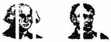
The first icon of George Washington is represented by the characters !"#, and Abraham Lincoln is represented by the characters $%.&.
Another thing you must know is that you are stuck with the sizes of the icons created in this manner. Since these are already magnified fonts, which I will talk about later, then you can't make them any larger using the magnify utility that comes with DD3. The only change you can make in size is if you print the icon in high density, or if you use the width command. Of course, doing either of those would result in an incorrectly printed icon.
What's What?
When the program converts the icon into DD3 format, it always starts at the beginning of the font. You cannot decide which three characters you want to represent an icon. The order of the characters used is the same as the order that they are printed out when you use the DD3 Font Editor to print out an entire font. Thus, the characters !":# will always represent the first icon created. It then proceeds down the line until all characters are used. The documentation provided by Mr. McGowan has a table in it that you can use to determine which 3 characters will result in which icons, numbered 1 through 30, for a given font. Here is the relevant information from his documentation:
| ICON |
CHARS |
ICON | CHARS | ICON | CHARS |
| 1 |
!"# |
2 |
$%& |
3 |
'() |
| 4 |
*+, |
5 |
\-./ |
6 |
012 |
| 7 |
345 |
8 |
678 |
9 |
9:; |
| 10 |
<=> |
11 |
?@A |
12 |
BCD |
| 13 |
EFG |
14 |
HIJ |
15 |
KLM |
| 16 |
NOP |
17 |
QRS |
18 |
TUV |
| 19 |
WXY |
20 |
Z[\\ |
21 |
]^_ |
| 22 |
abc |
23 |
def |
24 |
ghi |
| 25 |
jkl |
26 |
mno |
27 |
pqr |
| 28 |
stu |
29 |
vwx |
30 |
yz| |
Using this table, you would know that in order to print the twenty-second icon in an icon font file, with the icon font loaded in, and the horizontal spacing set to zero, print abc and the twenty-second icon will be printed correctly. You will note that two of the icons require four characters:
Icon number five has \-./
As I explained in a previous article, the reason for this is that, in DD3, the hyphen is soft! That is, when Roy Goldman created DD3, he realized that some hyphenated words can be broken up at the hyphen if that hyphenated word is at the end of a printed line. In order for the character spacing to look the best, he made DD3 so that if it comes across a hyphen in the middle of a word, it can break up that word at the hyphen so that the part in front of the hyphen (including the hyphen) is on one line, and the part after the hyphen is on the next line. If you do not want a word broken up at the hyphen, you must precede that hyphen with a backward slash(\) to prevent it. So, if you happen to print the -./ for the icon too near the right margin of a line, it will NOT be all printed on the next line, but will break after the hyphen, in the middle of the icon, splitting the icon up, part on the original line, part on the next line. If you replace the - with \ - (the hard hyphen) you will prevent this.
Icon number twenty has Z[\\
The reason for this is that the backward slash(\) is the command delimiter in DD3, not a regular character, and so it is not normally printed. In order to actually print it, it is necessary to type two hyphens in a row in order for one to be printed.
Magnified Fonts
When designing your own fonts or modifying existing fonts, you need the DD3 font editor which comes with DD3. The font editor will allow each character to be as large as 32 pixels by 32 pixels. It will not go larger than that. If, however, you want a larger font, you use the DD3 font utility which comes with DD3. The DD3 font utility will do one of three things. It will take an existing font and create an italicized version of it. It will take an Atari screen font, or character set, and convert it to a DD3 font. It will also take an existing DD3 font and magnify it vertically by a factor of 2, 3, or 4. It will not magnify horizontally. Use the width command \W for that. If the resulting magnified font has a greater heighth than the 32 pixels allowed in the editor, it will create a second, third, or fourth file, if necessary. The first file will have the extension NLQ. The second file will have the extension NL2. The third file will have the extension NL3. The fourth file will have the extension NL4. When you want to call up a multi-file font, such as a magnified font, you only need to call up the first one, the one with the extension of NLQ. DD3 will automatically know that to print out the font correctly, it will also have to load in the fonts that go with it. All of the files of a multi-file font must always be Together on the same disk, and in the same directory. DD3 will treat all of the multi-file fonts as one file. Earlier, when I showed you the icons of Washington and Lincoln, the command was:
\Fprsdnts\\S0!"# $%&
Although only one font, PRSDNTS.NLQ is called up, three others were also loaded. The font PRSDNTS.NLQ is actually a multi-file font. When DD3 loaded PRSONTS.NLQ, it also loaded PRSDNTS.NL2, PRSONTS.NL3, and PRSDNTS.NL4. Here is what the four fonts look like printed out separately:
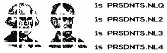
Think of each of those files as one-fourth of the font. DD3 knows that this font is a multi-file font. It automatically loads the others. The end result is a font that is 2, 3, or 4 times as high as a normal font. One problem with treating these fonts as one font, is that even though each is technically a font in its own right, only one line of normal text can be printed beside them. Look at the following example:
David Richardson Here is the command for the above example:
\Fprsdnts\\S0!"#\T\Fp1ain\\S2David Richardson\Z\R\Fprsdnts\\S0$%&
Notice all of the wasted space underneath my name between the icons. There is no way to type in the text in order to include things such as another line for my address, a line for my city and state, and a line for my phone number. They would have to be added underneath, like this:
David Richardson Address Line 1
Address Line 2
Telephone
Obviously this does not look that good. What is needed is a way to print the top fourth of the icon, then print in the text for the name. Next, print the second fourth of the icon, and print the address. Next, print the third fourth of the icon and print the city and state. Finally, print the last fourth of the icon and print the phone number. What is needed is a way to treat each of the four icon files as a separate font. Well, Mr. McGowan again came up with a solution.
Split 'Em Up
It turns out that the files in a multi-file font are just like a normal font, except for a few bytes in the file. John figured out that he could load each file into TextPro, which is a shareware text editor for those of you who may not know. With TextPro, he could change the appropriate bytes, and save the file back, with the result being that the file could be printed out as a font by itself. Of course, each font was only one-fourth of the icon. Since there was no user-friendly way to change the bytes, John created his own. What he did was, he created a TextPro macro which, when executed, would load in the appropriate files, change the bytes, and re-save them back. The macro is called FNTSPLIT.MAC, and it also included with my user's guide. It is the only way I know of to split a multi-file font into its separate components. By making these changes, here is an example of what you can do:
|
David Richardson Address Line1 Address line 2 Telephone |
|
This is roughly what my letterhead looks like. Of course, I used different fonts, margins, etc., but you can see how much better it is, and you can see the possiblities. You could make some nice mailing labels, for instance.
Since these fonts are now a font in their own right, you could, if you were REAL industrious, load each one into the font editor and change them. You could even load each one into the DD3 font utility and magnify them again, or even italicize them, but that would be pretty silly. The utility that converts Micro-Painter screens into DD3 fonts, GR8TODD3, works quite similar to PSTODD3, and it makes multi-file fonts also. Of course, GR8TODD3 is also included with my user's guide.
Do I Have To?
Many of you may be wondering about all of those commands that are necessary for the proper use of DD3. Like most things, the more sophisticated a thing is, the more complicated it is. This is true for DD3. To use the relative shift command \XS, for instance, not only do you need to know the command itself, but you also need to know what numerical value to put after it. Some commands need 1 number, some need 2, and some need 3. Some even use letters instead of numbers for the value. Many of you might have some questions. How can anyone remember everything? Won't I be constantly flipping through the DD3 documentation? The documentation will be dog-eared in a month! It could get very discouraging. Well, let me tell you this: I very rarely refer to the documentation that comes with DD3. Also, I very rarely refer to the User's Guide which I created myself. And, no, I did not memorize all of the commands. Yet I enter the commands with the greatest of ease. How is this so? Again, I have John McGowan to thank.
Mr. McGowan created yet another TextPro macro for DD3 which, in my opinion, is absolutely indispensible. He has taken virtually every DD3 command and made it possible to enter each one with a simple combination of keys. Once the macro is loaded into TextPro, simply hold down the OPTION button and the appropriate key to get the desired text to be automatically entered into the editor. The end result is that the text you would normally have to type in yourself is done automatically. Here is a listing of the macro keys, what the output is to the TextPro editor, and a description of the command it represents:
| Key |
TP
Output |
Description |
| + |
\\ |
Print \ |
| - |
\- |
Hard, Hyphen |
| c,C |
\C |
Centering |
| [space] |
\[space] |
Hard Space |
| f,F |
\F |
Load font |
| < |
\L |
Block Left |
| > |
\R |
Block Right |
| j,J |
\J |
Justify toggle |
| u,U |
\U |
Underline toggle |
| w,W |
\W |
Width |
| s,S |
\S |
Horizontal Spacing |
| d,D |
\D |
Density |
| l,L |
\XL |
Left Margin |
| r,R |
\XR |
Right Margin |
| x,X |
\XS |
Relative Shift |
| a,A |
\XA |
Absolute Shift |
| h,H |
\XHH |
Indent here |
| m,M |
\XH |
Absolute indent |
| e,E |
\E |
Erase Tab |
| p,P |
\P |
Place Tab |
| TAB |
\T |
Tab |
| z,Z |
\Z |
End text for C or R Tab |
| . |
\. |
Tab with dot leader |
| n,N |
\N |
New page |
| t,T |
\XT |
Top Margin |
| b,B |
\XB |
Bottom Margin |
| v,V |
\XV |
Vertical Spacing |
| g,G |
\A |
Append file |
| * |
\# |
Current page # |
| 1 |
!"# |
PS icon #1 |
| 2 |
$X& |
PS icon #2 |
| 3 |
'() |
PS icon #3 |
| 4 |
*+, |
PS icon #4 |
| 5 |
\-./ |
PS icon #5 |
| 6 |
012 |
PS icon #6 |
| 7 |
345 |
PS icon #7 |
| 8 |
678 |
PS icon #8 |
| 9 |
9:; |
PS icon #9 |
| 0 |
<=> |
PS icon #10 |
Icons 11 through 30 must be entered manually. However, as mentioned earlier, since it is not practical to create an icon font that is too large, this should pose no problem. If you hold down OPTION and hit RETURN, you will automatically get two returns and five spaces for starting a new paragraph. Those five spaces will be the equivalent of 5 spaces for whatever font is loaded at the time DD3 encounters them. Thus, the indention varies depending on the font. I prefer to use the relative shift command \XS010 at the start of each paragraph to create a one-quarter of an inch indention, regardless of the font. Hold down both SELECT & OPTION for the following macros for the little used commands:
| Key |
TP Outout | Description |
| h,H |
\H |
Set header |
| f,F |
\G |
Set footer |
| * |
\X# |
Set page # |
For the commands that require you to set a value, the command line of TextPro will display the options or values for that particular command.
This is quite a bit of information to digest, so I'll stop for now. I hope this has shown you how versatile DD3 is.
If you are interested in my User's Guide, which you print out yourself using DD3, you need to send 2 double sided disks for double density, or 4 double sided disks for single density. The disks must be formatted in either SpartaDos, Atari DOS or MyDOS format. You will receive ARCed files. If you have no unARC utility, let me know. Send some money to cover postage. Most people send $5. When all of the files are unARCed, they will fill up 9 double sided single density disks. The disks will include all fonts yet available for DD3 that I am aware of. They will also include the text files necessary to print the guide. The guide is 47 pages long when printed.
Until next time.