New ST Word Processing Entries
Microsoft Write
Of the seven editorial people at Antic Publishing who use the ST for word processing, four prefer ST Writer, one prefers Word Writer, another prefers Word Perfect and the last one says "the heck with it" and opts for the Flash capture buffer.
ST Writer is the ST Word Processor of Choice here at Antic Publishing because it does all we need. However, when a new word processor comes out for the Atari ST, the Antic and START editorial staffs are hot to review it, hoping that we'll finally see something that supplants ST Writer as the number one word processor. Believe it or not, it hasn't happened yet.
We had high hopes for Microsoft Write-it has some interesting approaches to word processing. But it hasn't toppled any of the favorites here, and some of the reasons follow: The [ARROW] keys function differently than you'd expect, keyboard commands aren't terribly mnemonic, the [DELETE] key doesn't delete characters under the cursor, the program doesn't necessarily keep up with you as you type.
Also, the tutorial-as do they all, it seems-assumes that you assimilated every bit of its wisdom as you go along. It might tell you to "select a line," and your response might be, "Now how the heck do you select a line again?" If the manual said, "Select a line-here, again, are the steps:" and then described the procedure, the tutorial would be easier to follow.)
INTERESTING FEATURES
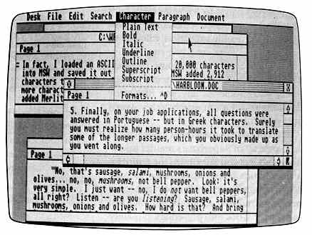
You could call Write a "full-featured" word processor. It's GEM-based and it can (but doesn't have to) run under GDOS. It can use any of several fonts in a WYSIWYG format. It has a search-and-replace feature as well as cut-and-paste, and a visible (non-editable) copy buffer called the Clipboard.
Write has an interesting Glossary window, comparable to macros, where you can store often-used text. Each Glossary entry has a name. Let's say that for some reason you plan to use the entire text of Lewis Carroll's poem, "Jabberwocky" in several documents. First, you'd type in the poem, complete with whatever formatting information is relevant. Next, you'd copy it to the Clipboard, open the Glossary window and type in a "macro" name-"Brillig" in this case. Finally you'd paste the text to Brillig. When it's time for "Jabberwocky" to appear in the text, just type Brillig and then press [CONTROL] [BACKSPACE]. Boom!-"Jabberwocky" appears onscreen as if by magic.
This feature could be perfect for applications such as script writing:
"eul" could mean "enters upstage left, and "xdr" could mean "crosses downstage
right." When you're done with your script, just Find "eul," go to the end
of that string and type [CONTROL] [BACKSPACE]. Then find the next "eul,"
and so on. This could take hours off the time you spend typing.
The search-and-replace feature (called "find-and-change") is interesting.
Let's say you want to change every occurrence of the word "you" to the
expression "the reader." That works fine, and whenever it encounters
"You," it'll use the right upper-case letter and replace it with "The reader"
I like that-it beats the heck out of doing two separate searches-and-replaces.
Microsoft Write, in addition to the program disk and a GDOS disk, furnishes disks with GDOS fonts and printer drivers for Star NB-15 and Epson FX-80 printers. Printing consists of setting up your printer and page dimensions, then printing a specified range of pages. While there probably should be an option simply to print the entire document, the printer setup is easy enough to use.
Typically, in most word processors, pressing [SHIFT] [UP-ARROW] or [SHIFT] [DOWN-ARROW] scrolls up or down one screen length, and [SHIFT] [LEFT-ARROW] or [SHIFT] [RIGHT-ARROW] move the cursor to the beginning or end of a line. Also, [CONTROL] [LEFT-ARROW] (or [RIGHT-ARROW]) often moves the cursor so many spaces (or one word) to the left (or right). In Write, however, any [SHIFT] [ARROW] combination highlights text for deletion (by pressing [RETURN]), cutting, copying, etc.
This takes some getting used to, but the worst thing is that some of the usual word processing keypress combinations (featuring [CONTROL], [DELETE], [INSERT] and the [ARROW] keys)-up or down one page, beginning or end of line, etc.-don't work in Write at all.
If you use a font other than "System," the program slows down, mainly at the end of a screen line, and especially if you combine font types. Boldface slows things down a bit. However, in italics the problem is that it's not just a "restatement" of the System font, but a completely different character set. Probably the worst offender is outline, which takes forever-I've found that the smartest thing to do when the program slows down like this is to avoid looking at the screen while typing.
Things like bold subscript would merely compound the problem, and outline subscript would be ridiculous. And when you use fonts other than plain text, screen scrolling slows down as well.
Write splits double-hyphens (-), meant to be used as em-dashes, when they occur at the end of a line. After a fairly short time, the program sometimes tells you that you've been working too long on a particular document, and that it's time to save it. In fact, the manual suggests saving your file every 15 minutes. Certainly it's a good idea to save your file every so often, but you shouldn't have to be forced to do so.
Write adds several characters to your file that describe formats, fonts, etc. In fact, I loaded an ASCII file of exactly 20,000 characters into Write and saved it immediately in Write format. Write added 2,912 characters to the file; no doubt it would add much more if I fooled with paragraph spacing or fonts. Most of those 2,912 characters were carriage returns.
Also, and this may be unique to Write, if you reach the bottom of the text window and keep typing, instead of scrolling to the next window so you can see what you're doing, Write lets you continue typing at the bottom- hiding at least half of that line under the gray slider area at the bottom of the screen.
While for my purposes I don't think that Write needs a spell checker, I do think it should have a word counter. I like word counts. I'm tired of writing up and saving documents in ST Writer or Write, then quitting and booting WordPerfect-just to get a word count. It would also be nice if Write told you what page line and what document line you're on as you typed.
The mouse is a wonderful thing, but, for the most part, I'd rather do everything from the keyboard while word processing. Luckily, Write lets you perform many keyboard functions, but it does seem to rely on a lot of drag-and-click maneuvers.
One thing Write lacks which I use frequently is an up-per/lower case toggle a la the [F3] key in ST Writer or [CONTROL] [SHIFT] [CAPS] in 8-bit PaperClip. Oddly, however, Write lets you increase and decrease font size. At least there's an extended character set, but the characters can only be accessed by pressing [CONTROL] [ALTERNATE] or [CONTROL] [SHIFT] [ALTERNATE] along with each character you want to type.
One annoying feature is the inability to set a default path-that is, I'd like it if, when I chose to load or save a file, the directory of my choice would appear onscreen without my having to set it during every session. Also, Write doesn't accept wildcards in the path name-the upshot of which is that disk directories consist only of files with a .DOC extender.
Write's oddly shaped mouse cursor is obtrusive, and there should be some kind of option to change its look, as in WordPerfect.
Microsoft Write hasn't generated much enthusiasm at Antic Publishing. The least-liked features are the bad keyboard response and strange [ARROW] key combinations, which no amount of interesting glossaries and searches-and-replaces can hide.
$129.95, color or monochrome. Atari Corporation, 1196 Borregas Avenue,
Sunnyvale, CA 94086. (408) 745-2000.
Fontz!
Fontz! ($34.95) is a program for producing fonts for use with GDOS-based programs. It's generally successful at making font production-a difficult, tedious task-as simple and efficient as possible. Fontz! features several powerful drawing and scaling tools for designing and modifying fonts, as well as converting fonts from other formats (such as Macintosh) to GDOS.
The number of programs that produce output using GDOS is on the increase. They include Neocept's new WordUp word processor, MiGraph's Easy Draw layout program and Timeworks' Publisher ST. The primary reason for this increase-aside from the fact that Atari has finally released GDOS-is that not only does the screen show a close approximation of the printed output, but the resolution of the printout is as good as the printer can handle.
To use GDOS output effectively requires several fonts to be used with the program. A font is a set of characters in a particular size and typeface. The size is measured in points, with 72 points per inch. A 10-point or 12-point font is normal for text, with perhaps a 24-point or 36-point font for headlines and an 18-point font for subheadings. The typeface refers to the way the letters are styled. Common typefaces include Helvetica, Courier and Times Roman.
To use a font in a program, you need several versions of it. First there's
the screen version. Most GDOS-based programs do not use the low-resolution
color screen, but you need versions for monochrome (high resolution) screen
and medium resolution color (depending on your monitor). You also need
a version of each font for your printer. As you can see, it can be a lot
of work just to create all the versions of a single font that you need-
especially if you have more than one printer.
Some fonts typically come with GDOS programs, but what do you do if
you need either different-sized fonts or an entirely different typeface?
Until now, you basically waited for the manufacturer to provide them. And
you could end up paying substantial amounts of money for the fonts when
they did become available.
The availability of Fontz! should change all that. Fontz! lets you: 1. Load a GEM font, modify it, and save it; 2. Scale a GEM font to a different size or printing device (with a different resolution); 3. Convert a font from the Amiga, Macintosh, Hippoword or DEGAS to standard GEM format, modify it and save it.
MODIFY GEM FONTS
It's much easier to create a new typeface by changing an existing face. For that purpose, Fontz! comes with a simple generic font. Once a font has been loaded, two windows open on the desktop. The window that's initially at the top of the screen contains an accurate rendition of all the characters in the current font. These characters may not be actual size, because if your output device has a different resolution than the screen, the character must be a different size in order to show all the pixels.
To select a character to edit, you can type the key (if it's a normal character, like a letter or number), double-click on the character in the top window, or enter the ASCII value of the character. The character then appears in the edit window, which contains a grid which you can adjust for size. You can also set or erase individual points in the grid with the mouse, or use the drawing tools from the menus. When drawing with the mouse, the left button turns a pixel on, the right button turns it off-this is not documented, by the way.
Drawing tools include circles, disks (filled circles), frames, filled rectangles, pie slices, lines and arcs. Each shape can be drawn in black or white. Whenever you select a tool, a help box pops up to tell you how to use it. Though the box disappears shortly afterward, it can get pretty annoying once you're familiar with the tools- which are so intuitive that you'll pick up on them right away It would be nice to be able to turn this "feature" off.
Fontz! also supports a buffer for cutting and pasting characters and sections of characters. The contents of the buffer can be overlaid or merged into another character, and you can even load a different font and move the contents of the buffer to the new font.
You can change a character's width or height by adding or deleting columns to the left, right, top or bottom. Note that this will affect the point-size. You can also shift or rotate a character as well as changing parameters such as the font identification number, name, location of the Ascent/Half/Base/Descent lines and special effects parameters such as bold and skew. Be careful when making changes-the font can be rendered useless, so keep a backup copy.
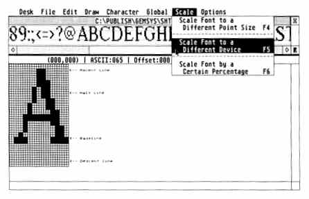
SCALING
Once you have gone to all the trouble of designing a font, you probably need to create other sizes. And you'll need at least two different device versions for your screen and printer. Fontz! provides tools for this as well, which can save vast amounts of time. You can scale a font up or down to a different point size, either selecting your new size from a dialog box of common sizes or typing in an arbitrary size.
Note that scaling down is not recommended, because information is lost. But I've found that if you scale down in small increments and do "touchups" at each step, you can get away with it. Scaling up doesn't lose information but the results tend to be blocky, so that again, touchups will be necessary. But this is still much better than drawing each size from scratch!
You can also scale from the current device (often the screen) to a new device (such as a printer or different resolution screen). Again, scaling up (to a device with a higher resolution) is recommended, with accompanying touchups. If your ASSIGN.SYS file has the drive installed for the device you want to scale to, that device will show up as a choice in the scaling dialog box. Otherwise you can still scale to a different device, but you will need to enter the resolution (dots per inch) of the device you want to scale to. Fontz! also lets you specify scaling up or down by a specified percentage.
One problem facing someone who wants to use multiple fonts is that there aren't a lot of fonts to use. While Fontz! lets you create your own fonts more easily it also has another useful option: you can convert the hundreds of Macintosh and Amiga fonts to GEM format. Many can be downloaded from bulletin boards, avoiding the Macto-ST format conversion. (Data Pacific's Magic Sac Translator 1 will let you read Mac disks directly.) However, the conversion from Mac fonts to ST GEM fonts is not entirely straightforward and the manual isn't clear enough here. Still, the conversion does work well most of the time, and having access to all those fonts is very nice.
CONVERTING FONTS
Fontz! also lets you convert non-GDOS fonts for the ST to GDOS format. This is primarily for owners of programs that provided fonts (such as HippoWord and the original DEGAS) who would now like to use those fonts in GDOS-based programs. Fontz! will not convert Publishing Partner fonts, however.
The manual for Fontz! is generally well-written, although it needs reprinting (the README file detailing changes is quite large). It's also a little murky, especially regarding problems with unmatched point-size and character height relationships. But it is the first time I have seen the filename format for GDOS fonts explained, and it also does a good job of explaining how to set up and modify your ASSIGN.SYS file-necessary if you want to use the fonts you have created. There is also a font troubleshooting guide, and a unique form of "copy protection:" a threat of bodily harm from the programmer (reputed to be a large, strong man) for anyone caught with a pirated copy Works for me, but I'm kind of a coward. Fontz! is not copy protected in the traditional sense.
Creating fonts has always been difficult and tedious. Fontz! makes this task considerably less onerous. With its abilities to draw and modify characters, scale fonts to different sizes and devices, and convert fonts from different formats, Fontz! is a "must-have" for anyone who is even remotely interested in new sizes and typefaces of characters to dress up their output.
$34.95. Neocept Corp., 908 Camino Dos Rios, Thousand Oaks, CA 91630.
(805) 498-3840.
WordUp
WordUp, Neocept's graphics-based ST word processor, boasts easy-handling power reminiscent of the Macintosh's famed MacWrite software.
WordUp takes full advantage of both GEM and GDOS and provides clear, sharp fonts and an excellent print quality It also lets you mix pictures with text. The $79.95 package contains two single-sided disks for 520STs, a double-sided disk for 1040STs and Megas and a thorough 284-page manual.
WordUp runs on a 512K system-provided you don't get too greedy with extra fonts and accessories. However, if you want a wide range of fonts (or the compatible Thunder! spelling checker), it's best to have at least a 1Mb system.
You can print graphics, straight ASCII or a range of pages, collate, set the number of copies, show or hide carriage return and paragraph symbols, etc., pause between pages (if you're using letterhead), quit or "quick quit," which brings you directly to the desktop.
The search function is the most complete I've ever seen. It finds words, phrases, special characters and format symbols. The replace function gives you the option of one, prompt or all. However, though you can search special symbols, you can't use them in your replace string.
You can adjust line spacing in points rather than single or double spacing. Margins are set from the desktop ruler. WordUp allows for different page sizes-letter, legal, index cards, etc. Almost all format commands are available either from desktop menus or from the keyboard with [CONTROL] or [ALTERNATE] key commands.
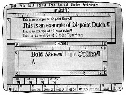
One thing that makes WordUp so different is the Font menu, from which you select faces, point sizes and other features. Choosing a feature after highlighting a block resets the text to the selected style, font or size.
Choosing normal typeface gives you the standard form of whatever font and point size is selected. It also resets a special style back to normal. Other types include bold, light (best reserved for fonts of 12 points or larger-it's like the ashes that would remain if you burned the letters away), "skewed" (italics), outlined (which hollows characters for special effects) and three differnt underline features. Also available is strikethrough, which puts a solid line through the middle of each character.
You can access the ST's extended character set only in Graphics mode. Trying to do an ASCII dump with them will lock up the printer. For superscript and subscript, you can set the height of the characters in relation to the text line, and you can choose a different font and point size. Combined with the extended character set, this feature can create complex mathematical formulas.
The face/points feature is where it really gets to be fun. Depending on how much RAM you have, WordUp allows an almost unlimited number of fonts (typefaces). WordUp comes with proportional Dutch and Swiss fonts in eight, 12, 14, 18 and 24 points, and a monospaced, 10-point Typewriter font.
During editing, as many as four text windows are available. Clicking on a window brings that document to the top for editing. The Glossary function is a powerful "super-macro" feature for words, phrases, special formats or entire pages.
WordUp lets you insert footnotes from either the menu or keyboard. You select a symbol for your footnote to be placed in superscript next to the desired word-and at the bottom of the page, with space' for the footnote. The program makes, room on each page for both text and footnotes.
The mail merge feature handles inputs from more databases than I can
list. The master page creates your headers and footers and can also add
graphics. These are then reproduced (in the background) on odd, even or
all pages.
The page numbering feature offers the choice of Arabic, Roman or alphabetical
format. The Insert Time and Insert Date features put the current time and
date (from the system clock) into your document.
Other options include automatic backup of ifies, saving a cut block of text that's in memory (upon exiting the program), giving you the chance to undo block or ifie deletes, and presetting your delimiters for the Mail Merge function.
PERFORMANCE
So how does it perform? Very nicely! Since WordUp is a 100% WYSIWYG word processor, everything appears on the screen exactly as it will on the printed page, including your fonts, graphics and even footnotes.
One of WordUp's best features is its constant, automatic reformatting of text as you type. The automatic reformatting and multiple fonts have virtually no impact on the overall speed of WordUp.
WordUp's keyboard response is constant, regardless of the font being used. However, I did find a slight speed loss when editing documents of 10 pages or more; or on pages containing footnotes.
WordUp's screen and printer fonts are both sharp and easy to read, though some of the 8-point screen fonts require some squinting. Print speed seems to be on a par with EasyDraw, with a dual-pass print used for each line. This is with a 9-pin printer, of course; the new Atari laser printer is supposed to be able to crank out a text and graphics page in under 30 seconds.
WordUp comes with drivers for Epson-compatible 9-Pin printers and will offer drivers for Epson-compatible 24-pin units, the HP Laserjet and Atari's SLM804 laser.
Importing graphics into your text is as simple as selecting Graphics, then choosing the graphic type and the file name. No conversion program is needed. Even nicer is the way text automatically flows around the graphic as you type. To speed up printing, use a RAMdisk or hard disk as your working drive to hold graphics files.
WordUp accepts .NEO, DEGAS .PI3 or .IMG picture files into text files. They can be sized, adjusted or cropped. The graphics menu options duplicate the functions of an activated graphics window for manipulation.
Since fonts and .IMG files are 100% interchangeable, WordUp is the perfect companion for those who have other GDOS based programs, such as Migraph's EasyDraw. And between WordUp, EasyDraw, Microsoft Write, and Neocept 's new font editor, Fontz!, we should soon be up to our eyebrows in fonts.
I'd liked to have seen features such as a Caps indicator for the [CAPS LOCK] key along with an available RAM display A built-in spelling checker and thesaurus would have been nice, but for such a low price, I'm not going to cry about it. I'd also like to be able to use the printer's built-in draft and NLQ modes with complete bold, italic, and other styles instead of the straight ASCII dump.
You can "force" dual-column print using the Master Page feature, but it's a less than elegant solution. WordUp also lacks the context-sensitive undo feature found in Microsoft Write, so any deletion you make is permanent.
I'd also have liked to see .TNY files added as a graphics option. My final suggestion would be a limited drawing function for lines and boxes to emphasize your text.
The only real bug in the program concerns deleting footnotes. The correct procedure is to delete the footnote number (or symbol) next to the footnoted word. Attempting to delete the footnote itself can crash the program. Also, a handful of the initial disks suffer from an undocumented bug in Atari's Malloc function (an operating system flaw) that limits the number of graphics per page to one. Neocept discovered this too late to stop the initial release, but quickiy wrote a PD patch to fix it and will provide upgrades for registered owners.
So what's the final score? WordUp is a very impressive program that can please even the most demanding user. It's fast, flexible, and produces a print quality that only GDOS or Postscript can provide. The user interface is intuitive (I learned to use it completely without documentation), yet the program offers features and power previously found only in expensive professional-level systems. Even better, it's far from expensive.
Though delayed, WordUp was well worth the wait. Neocept had a choice: release it on time with fatal bugs, or wait until it was bulletproof. They also chose not to copy-protect the program, trusting us not to pirate WordUp. Let's not rip them off.
$79.95, color or monochrome. Neocept, 908 Camino Dos Rios, Thousand Oaks, CA 91360. (805) 498-3840.