CYBER CORNER
CHINESE BRUSH STYLE With DEGAS Elite
By Angus Christian
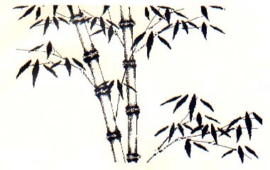
DEGAS Elite, one of the standard drawing programs for the ST, offers multiple work screens, GDOS text fonts and sophisticated block manipulation features, making it well suited to produce high-quality, original, black-and-white art for many professional publishing situations. To illustrate the program's capabilities, I'll show you how I simulated a Chinese monochrome brush painting.
I chose this style because it posed an especially grueling test. Chinese painting relies on fluid, controlled brush work for its effect. It has rigid rules of design, though each work must be a spontaneous composition.
Obviously I couldn't match the deliberate brush work of a master painter by drawing freehand with a mouse, so I took a different approach. First, I analyzed the structure of the style, solved each element as a separate problem and then reintegrated them into a consistent whole. My subject was the classic image of a bamboo tree.
From The Ground Up
Bamboo painting begins with the trunks (seldom just one). I placed them close together, but at an angle to each other so that they seemed to converge below the bottom of the picture. This compositional relationship is referred to in brush painting as "host and guest." Remember it because we will encounter it throughout the exercise. The stroke used to represent the segments of the trunk is called the "bone stroke." I used a variation of it for the smaller branches as well.
I selected the thick, diamond-shaped brush from the DEGAS palette and set down sixteen pairs of points to represent the ends of each section of bamboo. These also were the ends of my bone strokes. I didn't have to be precise, but I kept in mind that the final proportions of the trunks depended on the placement of these points.
Using DRAW I enlarged the points into big smudges, leaving some room to play between the pairs. Switching to LINE mode I chose the crosshair brush and connected the dots to form the bone stroke outlines.
Next, I gave the bone strokes some texture. Using outline mode I carefully positioned the crosshair just below the intersection of a smudge and a line (this works best with very jagged lines) and clicked the mouse button. The line thickened naturally toward the endpoint. I did this for all the endpoint/line intersections. If nothing happens when you try this, you simply missed the line; press [Undo] and try again. You can even try this along the midsection of one or two of your lines to relieve the regularity. Play around with your lines and thickening technique until you're satisfied with the bone shapes, then emphasize all of the left-hand lines by doubling-up on them or by going over them with a thicker brush.
Branching Out
Before adding branches I determined the general area where I wanted to place leaves. Next, I created a series of small bone strokes, starting the lines from between two trunk sections, and, using short segments, scribed gentle arcs toward the leaf areas.
When you try this leave a little space between branches. Remember the "host and guest" relationship when you draw in the second and third level branches. Each guest branch should play a subordinate role to that of its host.
I thickened the primary branches near where they intersected with the trunk by doubling-up on the lines. To complete my smaller-version bone strokes, I switched to DRAW mode and capped the ends of each line segment with a rough dot shape (not too big).
By now my work was starting to resemble a bamboo tree, with a nice "woodcut" look to it. For very simple graphic statements this look might be preferable to the more textured look that I eventually achieved.
Since I couldn't reproduce the continuous shading of watercolor, I had to compromise with a different texturing technique. Selecting the long vertical brush and switching to SMEAR mode, I carefully ran this brush down the left inside of my bone strokes. This gave me a stippled effect. The trick here was not to lose line definition in the edges.
I continued on into the ends of the bones, pulling the edges of the black areas into the white interior. Corrections were made with the AIRBRUSH in black or white mode as needed. I SMEARed the thicker parts of the branches as well. My results weren't the same as if I had used watercolors, but it was certainly suggestive of the desired style and, I hope, visually impressive. Again, my goal was to adapt the style, not reproduce it literally.
Lastly, The leaves
In bamboo painting, leaves are painted with single deliberate strokes and it takes considerable practice to be able to do them properly. There are also rules about how leaves are grouped together; I could exploit this feature to make up for my lack of expertise and a real brush.
In a different work screen I carefully drew the outline of a single leaf. When you create your leaf, don't worry too much about its size or orientation, just the proportions. You can use the STRETCH function to perfect the shape and copy it back to your leaf work screen. ROTATE or SKEW the leaf to give it an orientation of about five o'clock.
I used this single leaf to generate all of the others in my picture. I observed the "host and guest" rule in forming leaf pairs and never let them converge to a single point. I also added a smaller leaf off to one side for three-leaf groups and used pairs to build up four-leaf patterns.
The Chinese graphically refer to the proper angular relationship of such patterns as "fish looking for the same food." Keep this in mind as you assemble your groups and you probably can't go too far wrong. Don't use more than five leaves in a single group. As with the original leaf, use the BLOCK functions to create a basic palette of leaf groupings in different sizes. Save this screen to disk for use in the future.
To finish the composition I chose a group from the leaf screen and formed a block around it (make sure your blocks are set to X-RAY mode). Moving to the trunk screen I copied the grouping wherever I liked, keeping several points in mind. First, I tried not to place the ends of the leaves directly on the ends of the branches, but offset them wherever possible. Secondly, my palette was only a starting point. I continued to manipulate the patterns to fit in with the general composition, and, finally, I tried to make my leaves carry the curves of the branches.
For a master, this kind of painting is almost a performing art and it is common to "warm up" with a few before settling down to creating the masterpiece. If you saved both of the basic screens to disk (the trunks and the leaves), you can always repeat this final composition exercise until you achieve exactly the effect that you like.
Angus Christian is the owner of Scribes Design Co., a technical writing and graphic design company in B.C., Canada. This is his first article for START.