Secrets of a Good User Interface
Joseph P. Ferrari, Tim Oren and Jim Kent
This issue START invited three key Atari software figures to address the questions: What makes a good interface? What pitfalls should be avoided? How can a programmer help a user get up and running as easily as possible? Whether you're a programmer or a user, we think you'll find their insights valuable.
Ten Principles of a Good User Interface
by Joseph P Ferrari
The introduction of the Apple Macintosh in 1984 fundamentally changed how computers are used today. In the pre-Macintosh days, computers were definitely not for everyone - regardless of affordability. Because those early computers were severely limited in memory speed and storage capacity, the prevalent method of presentation relied heavily on the skills of the user.
This article discusses the 10 principles of a good user interface. The word "good" in this context refers to a principle that increases productivity since this is the primary purpose of computers.
1. Be Consistent
Since a particular program will be only one of many that the consumer
will use, the user interface should reflect the prevailing standards. Most
software programs have operations common to each other-for example, cut,
copy and paste. When these options are always placed under the same drop-down
menu, for example, Edit, the user can achieve an acceptable level of productivity
quickly without first struggling to learn the fundamentals.
Adhering to a common standard also helps to avoid user frustration. Assume, for example, that Control-X is commonly used for cut-and-paste functions; if a new program uses Control-X to exit without saving work, it will cause users unnecessary hardship and frustration. If a user encounters enough of these frustrations he or she will eventually turn to an alternative.
2. Reduce the Workload
Operations should be achieved with a minimum of user activity. Too
much "mousing around" means less time spent doing real work. For example,
features that require a stream of menu options and parameter settings to
perform a single operation are clumsy.
You can reduce the user's workload by building intelligence into the
application. For example, in a word processing program, the spell-checking
function should not require the user to enter the dictionary path each
time it's used. The program should have been set up intelligently so that
each time the spell checker is used, the program doesn't request the same
information.

Joseph Ferrari was the Director of Software Development for Atari Canada; after that, he directed software development for Atari Corp. U.S., where his efforts were focused on developing the Mega/Laser Printer combination as a desktop publishing workstation. He is now back in Toronto where his new company, Personal Productions Limited, develops interactive multimedia productions. Joseph says that because the general public tends to be intimidated by computers, user interface design is the number one priority for acceptance in the multimedia market. |
3. Reduce the Skill Required
Making your program accessible to the largest number of users is inextricably
linked to the degree of skill a user needs to operate it productively.
The first area to consider is the user's learning process. In many cases,
the user faces multiple problems when learning to use a new application:
A. The user must come to terms with how the program's functions are represented in computer actions. For example, many of the basic functions in a paint program are presented as a palette of icons representing graphic tools; in the user's mind, the toolbox metaphor reinforces the idea that in order to apply a function, it must first be selected.
B. The user may be unfamiliar with the application in any form, computerized or conventional, and thus faces the task of understanding its concepts while at the same time using the software to perform some specific function. In the learning stages, the use of common metaphors for operations, such as the file drawer or trash can icon on the Desktop, can provide considerable reinforcement and help the user achieve a deeper understanding of the application.
One of the most important and effective means of reducing the skill required is to provide the user with visual choices. Let the user select from a panel of options by pointing and clicking and eliminate the need to memorize the available options.
4. Communicate
Keeping the user informed at all times is a vital component of sustaining
or increasing the user's productivity. There are three simple rules that
should be followed:
A. During long operations, provide continuous or regular progress reports. However, the time when you need to communicate the most information with the greatest accuracy is during operations that have gone wrong. When an error occurs, you want to help the user recover from that error and restore normal operations.
B. Present the available options in a clear and concise manner; leave no room for ambiguity. As an example, the user has selected the Quit option and the following alert message is displayed:
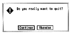
Does "Continue" mean to continue with the application or continue with the quit proceedings? What about "Abandon"? Leave no room for interpretation; keep messages simple and explicit.
C. Provide immediate feedback, both by acknowledging the user's action (in the case of selecting an icon, the standard feedback is to highlight the icon) and by letting the user know whether or not the operation can be started.
5. Make What You See What You Get
In a what-you-see-is-what-you-get (WYSIWYG) environment the user always
has a good estimation of the final form of the document and doesn't need
to constantly invoke a preview mode. A WYSIWYG environment usually shields
the user from unnecessary information; if text is to be in bold, it should
show on the screen as bold rather than displaying a scheme of codes.
The Apple Macintosh spearheaded the mouse-and-menu
interface- familiar images now but quite revolutionary in
1984 when the Mac was introduced.
6. Allow for User-Configurable Preferences
Since a program or environment must cope with varying degrees of user
proficiency, the product must accommodate the novice as well as the expert
and be able to mold various program characteristics to the user's preference
or level of expertise.
7. Provide a Stable Environment
Providing a stable menu bar or environment will keep the user in a
familiar atmosphere that makes learning easier. This does not mean that
a dynamic menu bar cannot be employed successfully, such as in a multi-application
environment where there are clear distinctions between aspects of the program,
as in an integrated word processor, spreadsheet and database program. The
changes would then assist the user by alerting him or her that the program
is entering one of the other fundamental modes.
Graying out the unavailable options in drop-down menus or dialog boxes is also effective for maintaining a stable environment while limiting options.
8. Forgive the User's Errors
An extensive undo function adds significantly to the user's confidence
to experiment and make changes. If the user does something that can't be
undone, an alert message should warn the user that the changes are irreversible.
9. Provide Keyboard Equivalents
Drop-down menus are an excellent means of introducing the user to an
application, but eventually the user will become proficient in specific
areas of the program; at this point, keyboard equivalents help the user's
productivity rise even more. Keyboard equivalents can also be used as shortcuts
to commands that normally would require several menu selections.
10. Maintain Aesthetic Integrity
Screen layout design should not be designed to dazzle or impress the
user; rather, the guiding motive should be honest to the principle of effective
communications. Simplicity is the key to clarity.
Another principle to observe is to avoid overloading the user with too much data in a screen layout; you don't want to fill every pixel on the screen. If the pertinent data cannot fit comfortably in one screen panel then divide it logically and use as many screens as required.
Summary
One main reason that the Macintosh has become a second standard in
corporate America is its user interface - and the fact that most of the
software developers have adopted the interface to a significant extent.
ST software developers will need to do the same to increase its future
chances.
Ergonomics-The Human Factor
by Tim Oren
(This article was excerpted from Antic Online's Professional GEM column.)
A reader of a novel or science fiction story must suspend disbelief to participate in the story. If the author's grammar or plot is clumsy it jars the reader and breaks down the illusion, pulling the reader out of the story. Similarly, a software designer who fails to pay attention to the speed and consistency of a program's interface will distract users from the program's functions and detract from the care that has been lavished on the function of the program.
Making an interface fast and usable is often treated as a black art. It isn't- there are well-known methods derived from the field of ergonomics, the study of interaction between man and machine The ergonomics of the human computer interface were studied extensively at Xerox PARC, the birthplace of the Alto, Star and Smalltalk systems which led to the Macintosh and the Atari ST. The designers of those original systems knew and applied the principles of ergonomics.
What follows is a short venture into the world of ergonomics. You'll find more than the usual quota of math, salted with examples of real design problems. But there's no way print can convey the vibrancy and tactile pleasure of a good interface, or the sullen boredom of a bad one. The best way to make ergonomics real is to look for your own examples. Get out your favorite arcade game and see if you can spot some of these principles in action. Dig out the most annoying program in your reject pile and look for the mistakes. Then look at your own work with a critical eye.
Fingertips
We'll start right at the user's fingers with the basic equation governing
positioning of the mouse, Fitt's Law:
T = I * LOG2( D / S + .5)
where T is the amount of time to move to a target, D is the distance of the target from the current position, and S is the size of the target, stated in equivalent units. LOG2 is the base 2 (binary) logarithm function, and I is a proportionality constant, about 100 milliseconds per bit, which corresponds to the human's "clock rate" for making incremental movements.
We can squeeze an amazing amount of information out of this formula when attempting to speed up an interface. Since motion time goes up with distance, we should arrange the screen with the usual working area near the center, so the mouse will have to move a smaller distance on average from a selected object to a menu or panel. Likewise, any items which are usually used together should be placed together.
The most common operations will have the greater impact on speed, so
they should be closest to the working area and perhaps larger than other
icons or menu entries. lf you want to have all other operations take about
the same time, then the targets farthest from the working area should be
larger, and those closer may be proportionately smaller.
Tim Oren was a member of the original GEM team at Digital Research and designed the GEM Resource Construction Set, later ported to the Atari ST. After leaving DRI, he designed the GEM version of KnowledgeSet's Graphic Knowledge Retrieval System, one of the first hypertext systems available for CDROM. At the same time, he was the author of the Professional GEM series of online columns in Antic Online and a contributor to the inaugural issues of START. Tim is currently employed by Apple Computer's Advanced Technology) Group, where he leads a project in multimedia information retrieval. |
Consider also the implications for dialogs. Small check boxes are out. Large buttons which are easy to hit are in. There should be ample space between selectable items to allow for positioning error. Dangerous options should be widely separated from common selections.
Muscles
If you have used the ST Desktop for any period of time you've probably
noticed that your fingers now know where to find the File menu. This phenomenon
is sometimes called "muscle memory" and its rate of onset is given by the
Power Law of Practice:
T(n) = T(1) * n-a
where T(n) is the time on the nth trial, T(1) is the time on the first trial, and a is approximately 0.4.
This first thing to note about the Power Law is that it only works if a target stays in the same place! This should be a potent argument against rearranging icons, menus, or dialogs without some explicit request by the user The time to hit a target which moves around arbitrarily will always be T(1)!
Eyes
Just as fingers are the way the user sends data to the computer, so
the eyes are the channel from the machine. The rate at which information
may be passed to the user is determined by the "cycle time" of the user's
visual processor. Experimental results show that this time ranges between
50 and 200 milliseconds.
Events separated by 50 milliseconds or less are always perceived as a single event. Those separated by more than 200 milliseconds are always seen as separate.
Suppose your application's interface contains an icon which should be inverted when the mouse passes over it. We now know that flipping it within one-twentieth of a second is necessary and sufficient. Therefore, if a "first cut" at the program achieves this performance, there is no need for further optimization, unless you want to interleave other operations. If it falls short, it will be necessary to do some assembly coding to achieve a smooth feel.
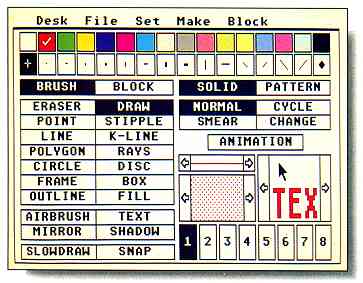
DEGAS Elite's main screen demonstrates Tim Oren's
description of "chunking," an effective way to optimize
the user's short-term memory by grouping several related
items. All filled drawing options are in one column; non-filled
options are in another column.
On the other hand, two actions which you want to appear distinct or convey two different pieces of information must be separated by an absolute minimum of a fifth of a second, even assuming that they occur in an identical location on which the user's attention is already focused.
It should be quickly added that stimulus enhancement will only work when it unambiguously draws attention to the target. Three or four blinking objects scattered around the screen are confusing, and worse than no enhancement at all!
Short-Term Memory
Both the information gathered by the eyes and movement commands on
their way to the hand pass through short-term memory (also called working
memory). The amount of information which can be held in short-term memory
at any one time is limited. You can demonstrate this limit on yourself
by attempting to type a sheet of random numbers by looking back and forth
from the numbers to the screen. If you are like most people, you will be
able to remember between five and nine numbers at a time. So universal
is this finding that it is sometimes called "the magic number seven, plus
or minus two."
only remember
between five and nine
numbers at a time.
This short-term capacity sets a limit on the number of choices which the user can be expected to grasp at once It suggests that the number of independent choices in a menu, for instance, should be around seven, and never exceed nine If this limit is violated, then the user will have to take several glances, with pauses to think, in order to make a choice.
Chunking
The effective capacity of short-term memory can be increased when several
related items are mentally grouped as a "chunk." A well-designed interface
should promote the use of chunking as a strategy by the user. One easy
way is to gather together related options in a single place. This is one
reason that like commands are grouped into a single menu which is hidden
except for its title. If all of the menu options were "in the open," the
user would be overwhelmed with dozens of alternatives at once Instead,
a "Show Info" command, for instance, becomes two chunks: pick File menu,
then pick Show.
Sometimes the interface can accomplish the chunking for the user. Consider the difference between a slider bar in a GEM program, and a three-digit entry field in a text mode application. Obviously, the GEM user has fewer decisions to make in order to set the associated variable.
References
This article is a modest sampler from a much larger field. The following
references will help you dig deeper The Card, Moran and Newell book was
the primary source for this article If you don't have the resources of
Silicon Valley, remember that your library can usually order these materials
for you.
Stuart K. Card, Thomas P. Moran, and Allen Newell, The Psychology of Human-Computer Interaction, Lawrence Eribaum Associates, Hillsdale, New Jersey, 1983. (Fundamental and indispensible. The volume of experimental results make it weighty. The Good Parts are at the beginning and end.)
"Macintosh User interface Guidelines," inside Macintosh, Apple Computer, Inc., 1984. (Though not everything ''translates,'' this is a fine piece of principled design work. Read and appreciate.)
James D. Foley, Victor L. Wallace, and Peggy Chan, "The Human Factors of Computer Graphics Interaction Techniques," IEEE Computer Graphics (CG&A), November 1984, pp. 13-48. (A good overview, including higher level topics. Excellent bibliography.)
J.D. Foley and A. Van Dam, Fundamentals of interactive Computer Graphics, Addison Wesley, 1984, Chapters 5 and 6. (If you can't get the article above, read this. If you are designing graphics applications, buy the whole book! Staggering bibliography.)
Ben Shneiderman, "Direct Manipulation: A Step Beyond Programming Languages," IEEE Computer, August 1983, pp. 57-69. (What do Pac-Man and Visicalc have in common? Shneiderman's analysis is vital to creating hot interfaces.)
Oren, Tim, "Professional GEM," Antic Online, CompuServe. (The complete text of this article and several others on the same topic are included in Tim's Professional GEM column in the Index section of Antic Online, log onto CompuServe and type GO ANTIC.)
The Perils of Decent Human Interface
by Jim Kent
START Contributing Editor
My first commercial program, the Microlliustrator, was a paint system written in 6809 assembly language for the Tandy Color Computer. I was very pleased with myself when I managed to squeeze the flood fills, rectangles, circles, lines, text, brushes, patterns and other graphic elements into about 3K of code in a month's work. All done, I said to myself-except for the user interface.
The Microillustrator interface was not that much by today's standards: no drop-down menus or overlapping windows. But we did have a cursor following the mouse, icons that would be highlighted when you clicked on them and a couple of different menu screens. I was more than a little shocked when it took another two months of work and 6K of code to implement it.
Now I have a text editor that does block copies, a C compiler to figure out what to put in what register and hundreds of libraries of functions I've built up over the years. It's not unusual to generate 3K of code in a day. However, one thing has remained constant: it always seems to take at least twice as long to build the interface as the rest of the program.
Pleasing All the People...
Different people like to control their computers in different ways.
Some people like the keyboard, some like to see their choices spelled out
in drop-down menus. Some people find drop-downs too slow and would rather
make a quick click somewhere on the screen and have something happen. So
to keep everybody happy you need to have three ways to do everything.
Keyboard commands work best if they are easy to remember. Spelling out
the keyboard equivalents next to their corresponding option on drop-down
menus certainly helps. It's also good to make the key the same as the starting
letter of the drop-down command. Sadly nearly half the words in the English
language start with S, T, R, N or C. As Jack Powell, former Antic Software
Product Manager, says: "Thank God for Word Perfect's Thesaurus!" Unless
a program is a word processor, it should not use the [Control], [Alternate]
or [Shift] keys as part of the keyboard commands; it's hard to press [Alternate
P] with one hand, and many people like to keep one hand on the mouse.

Jim Kent is a professional graphics programmer living in San Francisco. He wrote his first commercial programs, the Microillustrator for the Coco and Aegis Animator for the Amiga, while employed at Island Graphics. Since then. Jim has started his own company and written Aegis Animator and Cyber Paint for the Atari ST and Zoetrope for the Amiga. He's also had numerous programs published in START including Flicker (Summer 1987), the Audio Visual Sequencer (November 1988) and the computer animation programming language Pogo in this issue. |
Drop-down menus force you to spell out exactly what a command does in two words or less, and sometimes it's very hard to come up with a meaningful name. My suggestion - at all costs avoid using the words get, put, push, pop and buffer. These words tend to mean more to a programmer than to someone who's not, and also have different interpretations in computerese.
Selecting from a drop-down menu involves three steps: moving the mouse to the top of the screen, finding the drop-down that contains the item you want and clicking the mouse over a rather narrow strip to select it. If you can organize the drop-downs into logical groups and place the most commonly used items near the top or the bottom, the process goes faster.
The third component of a user interface is the panel menu-the area on the screen where a single mouse click tells the computer to do something. I usually put these at the bottom of the screen out of respect for the Quantel Paintbox, a hardware/software combination used by production companies which has one of the nicest interfaces I've ever seen.
From a programming standpoint, panel menus are the most labor-intensive part of a user interface. I have a program that will generate drop-downs from a list of the text, but panel menus must be laid out by hand. Adding an extra feature at the last moment can force you to visually redesign the whole menu.
Panels offer the quickest selection, so you'd like to put as much as possible in them. But the bigger your panel is, the less room there is for the text or picture the user would like to see Remember, the user has work to do. (Maybe MIDI programmers don't have this problem.) To save space lately I've taken to using both left and right mouse clicks over panel menus (eg. left-click to select a color, right-click to go to the color menu).
Got to Admit it's Getting Better
Object Oriented Programming Systems (OOPS) are much the rage these
days, and there is a reason. The work with SmallTalk at Xerox PARC inspired
GEM, the Macintosh display, Sun Windows and a host of other windowing systems.
Lately, I've had a chance to play with SmallTalk a bit, and I like its
windowing system better than any of these offsprings.
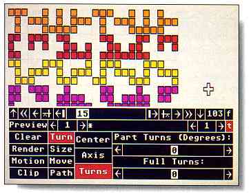
Jim Kent's CyberPaint interface employs three different
approaches: drop-down menus, keyboard equivalents and
panel menus- in this case the APM panel menu. While the
user is drawing all menus are hidden from view.
One idea Smalltalk uses that hasn't made it into the mainstream yet is to start a program in the same place you left it. In other words, instead of having to remember what you called a file, hunt for the place you were working on, reset your tabs, choose the correct font, etc., you simply run your text editor and you're in the same place you were when you last quit the program.
Remember the Basics
The two most important aspects of a friendly user interface are so
obvious that they are often overlooked in theoretical discussions: A program
must not crash, and it must be fast enough to keep up with the user. There's
just no substitute for machine coding speed-critical program sections and
then letting a hundred beta testers put a program through its paces.
If your design is too complex or your program too ambitious, you'll find it's nearly impossible to make your code fast and reliable. Keep it simple. Don't try to include every feature your product manager and early users suggest, or even all the ones you dream up yourself; it's better to do a few things very well. After all, you can always write another program once this one is bulletproof and in shrinkwrap.