the Animation stand:
Design for Living
BY MAURICE MOLYNEAUX
Over the previous four installments we've covered conceptualizing an idea, refining and storyboarding it. So you should have a fairly good idea of how the idea you want to animate will turn out. You have the "plot" and you have fie "script." That's a lot, but not quite enough. Unless you're doing s flying logo or something mechanical, you probably plan to have a character or two (or more) appear in your animation. Since you've storyboarded the animation, it's possible that you've already designed any characters you'll need, but it isn't necessarily the case. Whether or not you have any character design done probably depends on how detailed your storyboarding and sketching has been up until now.
By the way, for the past two issues I used the ant and magnifying glass sequence to illustrate storyboarding, rather than using material from the music video I mentioned as my actual example project. I did this because it was simpler to illustrate the story and break down techniques with a sequence like that rather than trying to demonstrate it with the music video. The rough storyboards for that encompass over 70 drawings at the halfway mark! I'll return to the music video this time, but we'll keep our ant friend around for when we need him.
Defining the character
Even if you already have a good idea of how you want your character(s) to look, it's still a good idea to explore the possibilities to see if you can come up with something better. As with everything else in this process, the look of a character might give you some more ideas or suggest variations on existing ones.
The first thing you need to do is list all the characters that appear in your animation, and alongside their names specify character traits and all the details you know about them. You should try to form a mental picture of a character that fits the traits and the name.
If they don't have names yet, give them names. Oddly enough, you'll probably find it easier to "relate" to these fictional beings if you give them a handle. Try to find a name that fits the type of character you have in mind. For example, the little ant character seen in the previous two installments is a rather smart character. You don't picture him as big and brutish, so a name like Crusher or Ivan seems inappropriate because they are "strong" names. You want something a little smarter sounding. Then again, you don't want something too "brainy" sounding or you risk a name that implies nerd-dom. You need a good middle ground, but nothing ordinary. Nobody remembers ordinary names, in film or in real life. People pay attention to names like Atari, Symbolics, Pixar and Rhythm & Hues, but aren't interested in names like Software Industries or Computer Data Systems, Inc. The same goes with characters. A name like George White doesn't say anything, as opposed to interesting names that fit the characters who wear them. Below are a few from some animated films, with a pat character summation. Note how the names fit these descriptions.
Harry Canyon: Cab driver.
Elmer Fudd: A drip for all seasons.
Hop Low: Dancing Chinese mushroom.
Speedy Gonzales: Fastest mouse in Mexico.
Wile E. Coyote: Cunning carnivore.
See? Elmer Fudd is a dumb-sounding name, suited perfectly to the dolt who wears it. Hop Low sounds vaguely Chinese and implies movement and jumping, which the littlest dancing mushroom (from Fantasia) does. Harry Canyon is a pretty bland name, perfect for a grubby cabby in the 21st century; but it's unusual enough to be memorable.
A convention in older cartoons and comics was to give characters names that were alliterative (meaning starting with similar sounds) or rhymed. Think about it. Alliterative names include Clark Kent, Lois Lane, Bugs Bunny, Mickey Mouse, Daffy Duck, Atom Ant, Secret Squirrel. Rhyming names include Foghorn Leghorn, Spike and Tyke and Magilla Gorilla. There are even "punny" names like Chip and Dale and Mac and Tosh!
The song I am going to animate a video to is called "I Know You." The title, which is repeated numerous times in the song, is the inspiration for the animation. The line "I know you" implies recognition, and the song's verses reinforce this. Thus, the plot I came up with is a simple one: A little guy sees a good-looking lady, is instantly smitten, thinks she was made for him and absolutely won't leave her alone. The title is repeated six times every chorus, for a total of 36 times during the entire song. My image is of the lady trying to avoid the guy, and he pops up and points at her on every single "I know you." No matter where she runs, no matter what she does, he pops up—no matter how impossible or improbable the location. No matter where she turns, he's there.
The humor in the situation arises from his popping up from the most unexpected of places. To provide myself with a veritable playground of possibilities, the video is set in a museum, allowing the guy to appear with sculptures, in paintings, out of ash trays, doors, lamps, fossils—anywhere!
Within this framework you can see that the only kind of character that will work for this guy is an obsessive type, one who is oblivious to the fact that the object of his affections wants less than nothing to do with him. Also, he needs to be flamboyant, hammy. As the unwilling target of his affections, the lady merely needs to be aloof and disinterested, without being completely cold.
With regard to your own animation you should weigh the situations you've planned and find the key points to the characters there. Even if you've already defined your characters, it's useful to go through this step because you may find the personality type you've come up with doesn't work particularly well with the plot line you've established. For example, putting a meek little guy with easily bruised feelings into the video I have outlined simply would not work without some major plotting overhauls. Seeing a poor guy rejected wouldn't be as funny as seeing an obnoxious guy get what he probably deserves (unless your gag material overcomes the inherent weakness of that character in the situation).
I have to repeat this: I am aiming for funny. You may not be and should not be unless that is specifically what you want and think is right for your project. Do what you want. My examples are just that: examples of the process.
Designing the character
Now that you understand the concept, I'll explain the character design. First of all, I knew right away the guy would be short and kind of unattractive and unfashionable—not ugly, but neither would he be tall or particularly handsome. The lady would, naturally, be a knockout; so he would have sufficient reason to go instantly ga-ga over her.
I wanted to get away from the classic cartoon style I'd used on Megabit Mouse. I wanted a kind of modern, angular look: very bold, with bright colors and hard lines—like a piece of modern art. The effect I was after was somewhat minimalist. Small details would be omitted. The only things that would appear would be what was necessary to show. If the guy's hands weren't doing anything important, they'd be simplified to mere shapes, void of details such as lines separating fingers. I pictured characters made up of geometric parts. Perhaps the guy would be made of round parts, the lady out of angular ones.
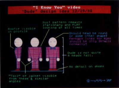
Round lost out quickly because it didn't look energetic or interesting. The music is up tempo; the pace of the planned action is fast. Therefore I felt the best character design would be something bold and hard edged, something that would look good even in fast movements. Following this thinking, a suggestion was made to give the guy a square-shouldered look, almost like a zoot suit. My first inclination was to give him a triangular body, rectangular limbs and wedge-shaped shoes. A sharply angled head didn't appeal to me, so I made his head and hands round. Figure 1 shows how I drew up a model of this concept on the ST to see what it would look like.
I got the opinions of several friends on this model. We agreed that while the general concept was on target, there was room for improvement. The round head didn't look right. Someone commented that the tails I'd indicated on the bottom of the suit triangle should be separated. Everyone thought the coloring appropriately tacky (this dude has no taste in clothes).
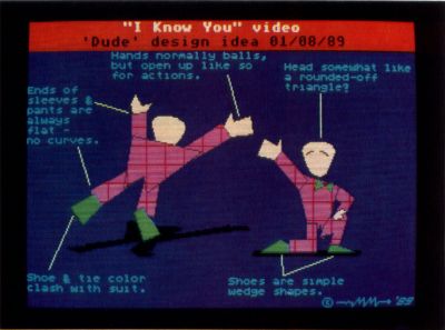
I whipped out a sketch pad and started scribbling. I doodled the guy doing some dynamic things, to get a better idea if this model would work. I could see how splitting the tails on the suit could improve the look of the character. I also played around with a geometric head shape, but hated it. I finally compromised with a rounded-off triangular head, which seemed to fit the bold design without being too harsh. I quickly drew a couple of these poses on the ST and realized I was getting closer. I began to think that the coloring on the guy's suit didn't clash enough; so I decided to try a check pattern made of green lines on the magenta suit and made the bow tie and shoes green also. As you can see in Figure 2, the suit pattern was always planned to be completely flat, with no effort taken to create an illusion of depth or to make the pattern "follow" the lines of the character's clothes.
How can I sum up this look? Perfect! Perfectly tacky!
Up to this point I had kept the guy's head blank—no ears, nose or mouth. The only face was made up of two horizontal lines for his eyes. This was in keeping with the minimalist ideal, but left his expressions rather flat. I experimented with his design a bit more, drawing him in a number of postures and positions. I found out that even the most energetic and emotional poses were weak without a real face. I tried modifying these sketches, adding appropriate cartoon eyes. I refrained from adding any other details (the mouth would appear only when necessary, like if he smiled sheepishly). The cartoony eyes suddenly opened up his range of expression, and he instantly gained an appeal the earlier designs had lacked. I tested these designs on the ST and the design was finalized as in Figure 3.
Well, more or less finalized. Small refinements will come when the first animation is tried. When you start moving the character, you begin to find design flaws, which can usually, but not always be easily corrected (legs may need lengthening, and so on).
The lady proved to be a more difficult proposition. I had to try to make a bunch of angular shapes look like a good-looking woman. Not easy! It took a lot of sketching before I got something that worked. As with the guy, it wasn't enough for this woman to just look good. She had to be flexible enough to go through the motions required, stylistically match the guy, and look good. I couldn't make her in a completely different fashion. I wanted graphic harmony, not discord!
While such stylized characters are in some ways easy to work with, they tend to have a rather limited scope. Their range of movement and expression is curtailed by their simplified design. A frown doesn't come across well without a mouth, and sniffing is tough without a nose.
A character like Megabit Mouse is another matter entirely. Like film cartoons of old, he is built up from round elements, which not only makes him cuter but also simplifies things because many of these building blocks maintain the same shape at any angle. To build shape tables of the guy in the music animation would require scores of different bodies in varying positions. Megabit's body is a sphere, which looks the same at any angle, so only one is needed (more if his size is to change). To give this ball-shaped body some direction a tummy spot is added (as a separate element), and his limbs are used to complete the illusion that there's more detail than actually exists.
The ant discussed previously could be drawn in a number of ways. As to basic body structure, because he's an insect a segmented body (head, thorax and abdomen) would be a good idea. The amount of detail, modeling, or lack of it, would permit dozens of wild variations even within this basic structure.
In the original rough storyboards, the ant had six limbs. By the revised boards (last issue) he had only four. The extra two got in the way, would have complicated the animation and weren't really necessary. They just complicated the matter without adding anything, so I left them off. Again, such decisions must be made on a case-by-case basis. If I'd storyboarded different actions I might have found the extra limbs useful and left them on. You'll have to decide what is desirable and what is better left out.
If you look at Figure 3 again, you'll notice that one of the things I was doing in drawing all these poses was to get an idea of the character's range of flexibility: what kinds of expressions and postures I could expect to get. It was a way of exploring the limits of the character's flexibility before committing a lot of time to an animation test. I could see if the parts were proportioned correctly, fit together in the right way. It also let me see if the character looked good and gave me an idea of the possible appearance of the final product.
There are a lot of different styles and approaches to character design; so many that to try to discuss even the most basic forms would take more space than I have. Let's just say that styles in animation can vary as much as in any other graphic art. There are hundreds of different approaches you can take for any given character, and in a lot of cases no one of those is the right one.
I highly recommend generating test models of your characters on the ST as soon as you have a good idea of what they'll look like. You may find that the resolution and limited colors force you to make changes in your designs. This applies no matter which program you are using. If you're generating 3-D model characters, try building a rough model to see if it looks okay. If using a more conventional paint/animation system, draw it. It's also useful to try to determine your color palette at this point. Normally we've got only 16 colors to play with, and you should endeavor not to waste any. In the case of the man and woman in the music animation, I was careful to draw them with only eight colors. The remaining eight can be changed to suit the needs of a specific shot. To keep this consistent I created a master-palette screen that lists all 16 colors and indicates which are reserved and for what purpose.
Endless pose-abilities
There's a dying art in animation known as character posing or just plain "posing." When you pose a character, you put the character in a position, posture and attitude that convey something about him/her or the situation they are in. For example, if you needed to scare a character, the first thing that most people would think of is drawing a wide open mouth and bulging eyes. All fine and good, but it's not as effective as combining that expression with body language, which can heighten the effect. When you're angry, you tense up. When you're sad, you tend to droop. People are very face-oriented, but if you look at most people, you'll notice that their body language can often be as revealing as the look they're wearing on their faces.
Using poses in animation is a somewhat tricky business. It requires you to find the pose that conveys the information you need, but at the same time will allow for a smooth transition into the next position (unless you want a complex, difficult transition). It must also fit in the scene. This may not sound all that difficult until you try it. One of the most difficult shots I ever had to storyboard was posing the guy in the music animation as he knocked on a door, opened it and leaned through the door frame.
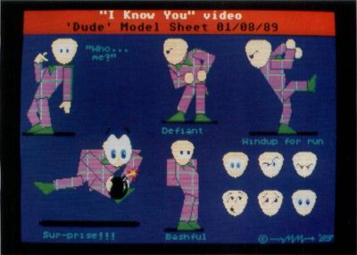
Probably the master of posing animated characters is Chuck Jones, director of hundreds of Warner Bros, cartoons. He described an animator as an "actor with a pencil," a statement which he could well apply to himself. His cartoons, particularly those dating from the late 1940s through the end of the 1950s, are beautifully staged, with expressive poses punctuating the situations and dialogue. The transitions between these poses are also excellent. You are not really aware that the poses are being struck, because they are integrated so well into the action. Refer to Figure 3 once again, and you'll see some relatively simple but effective posing. The character's whole body reflects each of the expressions and makes them clearer to the audience. This is of great importance considering the rapid pace of most animations. You have to find the best way to convey the information as quickly and clearly as possible.
Creating a series of poses and then going back and adding the movements between them is known as "pose to pose" animation. Animating a sequence from start to finish without using the pose to pose method is known as animating "straight ahead." The pose-to-pose technique allows careful planning and well-staged and choreographed action. The straight-ahead method is more spontaneous and sometimes results in more interesting output, though animating without a road map like this can also leave you with an unusable sequence.
Due to space limitations there are a lot of subjects I can only touch upon. Posing is one of them. Some specifics related to posing within an animation, such as line of action and silhouetting action, we'll tackle when we get to the actual act of animation.
Which program?
We're at the juncture where, if you haven't made up your mind already, you need to decide what program or programs you'll be using to create your animation. If you have multiple programs, you should weigh the capabilites of each and decide which program will allow you to do the job with the least labor, and, more importantly, which program will produce the best results.
In the case of the music video, my plan is to animate the characters using Film Director, because it allows the greatest editing control and flexibility for cel animations. But, I'm not stopping there because speed is important as well, in addition to various "camera" moves planned into the video that Film Director cannot handle. Thus, once the characters are animated, the Film animation will (laboriously) be converted into a Delta file format and moved into Cyber Paint for polishing. Cyber Paint's playback is faster than Film's, plus it's video-effects-type tools will allow the addition of such effects as motion blur, image distortions, and so forth. Several other programs will also be involved, including CAD-3D and Cyber Control (to plot out a rotating mobile), and an old ray-tracing utility (why? I'm not telling yet!). On the hardware end, there's the Genlock I had installed in my ST last week (see Step 1 in this issue).
Why all these tools? As I said at the beginning of this series, I come up with the idea first, then pick the tools to do the joB. The fact that I have to use a lot of them doesn't thrill me, but if there were an easier way to do what I want, believe me, I'd do it. There's nothing wrong with doing it the easy way—as long as the easy way is the right way. As usual, in regard to your own project, you'll have to decide that for yourself.
Next issue it's on to actual production stuff, as graphics start to form, and test animations begin. I'll also tell you about a neat tool, called a "pose reel," used for pretesting your animation.
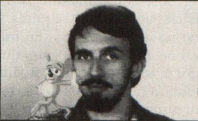
Maurice Molyneaux couldn't think of anything smug or impressive to say about himself this month—but don't expect it to last long.