In my last article, I mentioned Daisy Dot III's ability to let you design your own fonts using the Font Editor. Let's see if I can get you started on doing this yourself. The easiest way is to take an already existing font and use it as a starting point. Once the Editor is loaded up, simply load in one of the fonts you already have. Maybe you should choose one you don't like. Whatever it is you don't like about that font, you could change it to your liking. Perhaps you want to make a character look smoother or easier to read. Maybe one of the letters of a font looks funny to you. A good example would be the "A", "W", "g", "p" or "q" of the PLAIN.NLQ font:

Maybe you think the sides of the "A" aren't straight enough. The same could be said for the "W". Maybe you think that the letters "g", "p" and "q" need to have the vertical straight line a little closer to the round part. Maybe you want the whole font larger, or maybe smaller. Any of these are good ways to get started, at least until you get the hang of it.
The Birth of a Font
If you choose to start from scratch instead, you could do the easiest letters first. These would be the "I", "H" and "O". Here is a way to make a very simple font from scratch: to make the "O", just draw a perfect circle using the circle-drawing command of the Editor. For the "I", simply make it a vertical line. Once these are done, use them to create other letters. The Editor has a "Transcribe" command. This means you go to a letter you haven't done yet or you wish to change, say, "C". You then "transcribe", or copy, the already created "O" to where the "C" is supposed to be. You now have two characters that look like an "O", but the one you are on now is simply an "O" that will be transformed into a "C". You then erase the part of the "O" that you don't want and you have a "C". You could then transcribe the "C" to the "G" and add a horizontal line and you have the "G". Transcribe the "O" to the "Q" and add a small line in the lower right-hand corner and you have the "Q". Transcribe the "I" to the "T" and add a horizontal line across the top. Transcribe the "I" to the "H", widen the box and scroll the "I" to the side and draw another "I", and then draw a horizontal line between them, and you have an "H".
It doesn't take long to do these. In just a few short minutes you have the letters I, O, C, G, Q, T and H. This is 7 out of 26 upper case letters, which is better than one-fourth of all the upper case letters. Another easy letter is the "E". From here you can transcribe further: O to D, E to F, E to 8, E to L, H to M (erase the horizontal and add the "V" shape), H to N (erase the horizontal line and add a diagonal), B to P, and P to R. You now have B, C, D, E, F, G, H, I, L, M, N, O, P, Q, R and T. That's 16 out of 26 without a lot of hard work. You could transcribe the "M" to the "W" and then flip it upside down. The "U" could be an "O", but with a smaller circle, then you just erase the top half and add vertical lines. From the "U" you could then make the "J" simply by erasing part of the left vertical.
The "X" is easy to make. Use the "Draw Line" command of the Editor. Cycle through the "mirror" option until it is on "Vertical". Put the cursor at the upper left and hit the joystick button. Now move the cursor to the lower right and hit the button again. The entire "X" will be drawn. From the "X" you could make the "K", although you would probably have to modify it a bit. The "V" is easy too. Keep the mirror at "Vertical" and in the "Draw Line" mode. Place the cursor at the upper left and hit the button. Now place the cursor at the bottom edge but only half-way across and hit the button. The entire "V" will be drawn. Flip the "V" vertically and add a horizontal line and you have the "A". This leaves the S, Y and Z. The Z is easy also. Draw a horizontal line across the top and bottom, and then the diagonal. The Y could be made from the V. Scroll the "V" half-way up the screen. The excess part of the "V" will "wrap-around" and come up from the bottom. Erase these and add a vertical and you have the "Y". A simple "S" could be made from 2 circles stacked on top of one another, erasing the excess. That covers all 26 upper-case letters.
Recycling Letters
These would be very crude representations, and fancier letters would require a little more effort. The point I'm trying to make here is that you don't necessarily have to literally draw every character. A lot of time and frustration can be avoided if you can use a letter you've already done. If you will sit down and think these things out, you could make font-creating more enjoyable and less time-consuming. This is especially true if you use the Editor's built-in drawing aids.
What applies to upper case letters also applies to lower case. Make the "n" first; from that you should be able to make the "m", "h", and "r". Use the "o" to make the "e", "c", and "p". Flip the "p" horizontally and you have the "q". Flip the "p" and "q" vertically and you have the "b" and "d". Modify the "q" to make the "g". This same line of thinking can be used throughout the font.
As far as the numbers and punctuation characters go, you can use already-made letters to make them also. Just use your imagination. One thing to remember is that if you're creating a font that will have both upper and lower case, don't use the entire height of the Edit window for the upper case. You must leave room for the descenders of the lower case letters. When designing the more complicated fonts, I've found it best to do the harder characters first. If you can't fit an entire "W" in the window, then either try another design or use two characters to make the "W". This means you must give up one of the other characters. Since a "K" is often a hard character to get to look right, I often try to do it first. This way I don't get a whole font done only to find out that I can't make a "K". Also, you might try doing the lower case letters first. If you can't get them to look right, you might think of eliminating the lower case altogether. The hardest characters to design are S, W, K, M, and most of the lower case letters. Also the &, @ and % are hard to do. I won't think twice about leaving these characters out altogether. This is especially true with the more elaborate fonts.
Don't Re-invent the Wheel
Look at the PLAIN.NLQ font and see how many letters are almost exactly like other letters, except they are oriented differently:
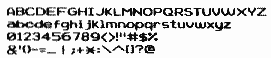
Notice how the "b" and "d" are mirror images of each other and so are the "p" and "q". The "6" and "g" are the same character, but one is flipped both horizontally and vertically. The "3" was made from the "8", which was made from the "B". The "u" is simply an upside down and flipped "n". This is how you save time and effort.
You'll find that sometimes the printed character looks better than the one on the screen and vice versa. There were many times when I thought a character looked poor on the screen, but it would print out very nice. There were also many times when it looked perfect on the screen and the printed character left something to be desired.
Troubleshooting
In the process of creating a font, you'll either try to save the font or go to another character in the font. When you do, the Editor checks the bit arrangement of the current character to see if it would result in the program trying to send the illegal values of 13 or 155 to the printer. If such an arrangement is found in the character, the Editor will ask you to edit a specific column (0 through 31) on either the top or bottom half. This means you must actually change the way your character looks. It might only be one pixel, but that one pixel may be the one you really need to make that character look right. You may find the only way to get the Editor to accept it is to change a pixel you don't want to change. There should be more than one way to satisfy the program into accepting the character. Keep trying different ones until you find one you're happy with and the computer will accept.
I had this problem in designing a font called COOPER.NLQ: I wasn't happy with any of the arrangements that were acceptable to the program. Then I had an idea. I put the character back the way I wanted, and tried it again and of course, it wouldn't accept it. Then I tried one more thing. I scrolled the whole character down one pixel, and it was accepted! This simple change altered the bit arrangement. I then went through the whole font and lowered each character one pixel so they would all match. If you encounter this problem, you might try this solution. Of course, this could change a previously legal bit arrangement of another column into an illegal bit arrangement.
There's a font I designed called LADDERS.NLQ which comes with DD3. I couldn't for the life of me get the "#" symbol to be accepted as a legal character. Since I had already designed some other fonts that Roy hadn't seen yet, I sent them to him along with LADDERS without the "#" character. I told him about my problem. He got one to work and sent it back. The one he came up with looked like one I had tried. Since LADDERS was one of my first fonts, I probably hadn't tried to scroll the character either up or down. Sometimes when you work on something a lot you might overlook the obvious. So, if you can't solve it, let someone else try. Their fresh point of view may be just what it takes to solve the problem. You can sometimes accomplish the same thing if you put down what you're doing and get away from it for a while. When you come back, you might see something you hadn't seen before.
As always, I'd love to see any fonts you create.